“Meh, if the art’s good I’ll probably read it.”
I’ve heard this so often in relation to webcomics I’ve started to wonder; is the artwork the main draw for webcomics? I won’t deny that the quality of art is an important factor, and I do love visiting sites like Kinokofry or Bolt City (which sadly no longer updates) simply to ogle at the wonderful amount of effort put into the artwork. But for me personally, the main draw is the quality of writing and/or how gripping/funny the plot is, with the art simply there to showcase and compliment that writing in an eye-catching manner.

Funnily enough, I have a real-life example to hand. With the recent big continuity reset that is DC’s wave of “New 52” titles, I took the opportunity to experiment with my comic-book likes and dislikes (I’m still relatively new to the whole concept of reading comics weekly/biweekly in paper form), and picked up Frankenstein - Agent of SHADE #1 to try out. I instantly noticed what a weird scribbly style the art was, and decided to quit reading it. But then I noticed the wonderful way it packed itself full of original, clever ideas... Skip ahead a couple of weeks and Frankenstein is a cornerstone of my pull list, and I’m beginning to notice how the visceral, dynamic style really suits the story!

So, what would happen if I were to stop reading webcomics that use stick figures or bubble figures (i.e. figures made up of simple shapes)? Well, half of my Gag-A-Day list would have to go out the window, these quick and funny comics usually need to use simple visuals to stay quick on the uptake. Among their number would be XKCD, a wonderful Gag-A-Day with a smart-science-and-maths angle to the jokes, and that would be a hard loss to bear. And where would you stop? Would the great and powerful Nedroid Comics fall under the “bubble figures” category? Anthony Clark’s main characters certainly do resemble a series of quick ovals with body parts, but I’ve always admired that child-like charm about them. And Anthony is certainly capable of some beautiful “artwork” when he sets his mind to it, if that’s what you’d prefer.

Not forgetting, some webcomic artists actually admit to not using their full abilities on their pages on purpose, either for simplicity’s sake, or because silly/ugly looking stuff adds an extra layer of comedy to a funny strip. Andrew Hussie of MS Paint Adventures has stated that he does this for exactly those reasons, and even says he’s lost some of his artistic ability due to lack of practice. Talk about suffering for your art!
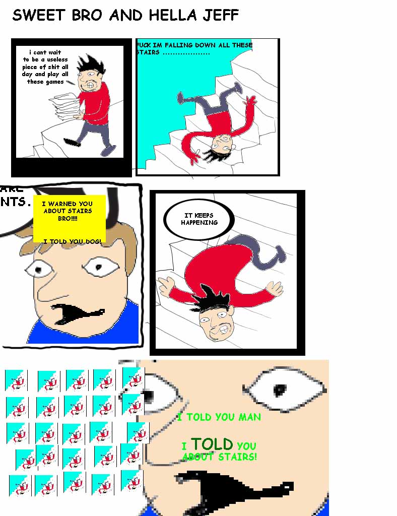
I’m also reminded of MSPA’s spin off comic, Sweet Bro And Hella Jeff - in the latest story arc of the main comic, one of the primary characters is an internet savvy “cool kid” who enjoys doing things for ironic purposes, and has even gone as far as ironically ironic (and on rare occasions reaches a third level of irony! Don’t ask). In his spare time he creates an intentionally shoddy webcomic that Hussie has made into a real site, purposely full of very badly rendered jpegs (with horrible pixilation) and weird spelling mistakes. Needless to say, for those with a very odd sense of humour it is hilarious comedy gold.

Of course, a key question that needs to be asked at this point is: what do you consider as “good” art? In my experience, personal tastes can vary wildly, and one man’s Picasso is another man’s collection of odd-shaped blocks of colour. For example, I’m a big fan of the long running webcomic Girl Genius, but a good friend of mine can’t get into the story because he says the odd artwork keeps distracting him. I don’t agree with him, but I certainly respect his opinion. Plus there’s always potential for slightly bad art to get better over time, regularly updating a weekly webcomic is a great way of practicing and mastering illustration.
The main point I’m trying to make is: don’t judge a book by it’s cover. I’ll concede that there are some things on the internet that are truly awful and not worth anyone’s time. But if something just has a slightly off-kilter style, or is artistically simple by design, give it a bit of a chance first.
Todd Marsh is slowly starting to froth at the mouth for the Avengers movie. Sssslowly.

I should clarify; at the top there I mention Bolt City, but what I actually meant was Bolt City's series of strips called "Copper": http://www.boltcity.com/copper/
ReplyDeletehow about the man of many shades? http://www.themanofmanyshades.com/
ReplyDeletethat comic is great! and the artwork isn't incredible but it works for the story